The best situation for both the client and the graphic design professional is for a client to have a clear idea of what they want. Without a clear idea a lot of time & money can be wasted. Of course in creating a logo one has to consider the goals behind the brand. In the case of Health Insurance Expert, Jeff Weiss, he was very clear on what he wanted:
- The Name
- The Tagline “It’s about the relationship, not the policy”
- Include a Caduceus
- Probably the colors blue and green
- Keep it Simple
Is Basic Information Enough to Create a Logo?
In a more nuanced business model than health insurance sales you might want to hold focus groups, create mind maps and much more. BUT, that isn’t this situation. This situation is a very clear business model: Health Insurance Sales with a focus on educating the consumer.
What About the Psychological Impact of Color?
When I met w/ Jeff, we were talking right away about the colors blue & green being a good choice. Blue for trust and a double meaning because blue is used for healthcare a lot, even on signs directing you to the hospital. Green represents nature & cleanliness and by inference health.
The Logo Design Process
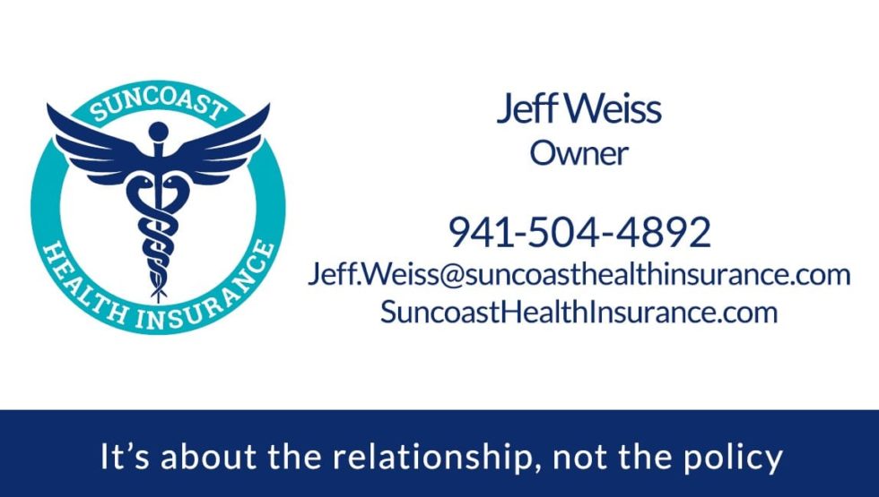
First, we worked with Typefaces. Because I like to make sure to use fonts that are readily accessible on the web I started with Google Fonts. After trying several I settled on Roboto Slab for the Logo and Lato for other text. You can see an example on the business card below.
Second, we worked on the Caduceus starting with a vector graphic from a stock photography site. We wanted something uniqud so we opted for a caduceus with raised wings vs. the traditional look. We showed many cadeceus options to the client and recommended this one. The vector graphic was modified in places to my own tastes. One detail I prefer is to have the top “Ball” separate from the staff. It makes it stand our more. Another change was shortening and rounding the bottom of the staff so it wasn’t so long or so sharp.
Third, we worked on the type on the circle getting the size right, tweaking the thickness of the circle.
Because we believe a logo should look right in black and white we start there. After settling on the type, the circle and the size & position of the caduceus we offset the caduceus wings and subtracted the overlapping area from the circle to create negative space around the wings.
Finally, we chose several color combinations and discussed them with Jeff.
In the end we chose the logo on the top left to be the “official” logo and reserved the possibility of using the lime green version on the left side as an alternative.
Once a logo is finalized we sent various formats to the client and typically we create other collateral such as business cards.